For ages, in-stream TV commercials were a leading approach for advertising. Since the world has been quickly transitioning from
cable TV to over-the-top (or OTT) internet services, advertisers are losing the channels to deliver messages on TV to their customers.
To help them grow their business, Samsung Ads uses Samsung smart TV UI as a platform to discover advertising opportunities. At the time I got on board,
Samsung Ads had very few monotonous ad placements. The product was eager to expand and grow.
My Role
As the lead designer for owned-and-operated ad units on Samsung smart TV, my top priority is to execute my design vision by partnering up with the
cross-functional team to deliver a high-quality user experience.
In the past years, I've helped the team ship out a good number of ad products, and the business has been growing 100% year over year. This article is about my
general design process, a brief showcase of the final products, and my learnings throughout the process. For a deep dive into case studies, please
contact me.
(For my non-disclosure agreement, I omitted and obscured confidential information in this case study. All information
in this case study does not necessarily reflect the views of Samsung.)
How I Design
Research
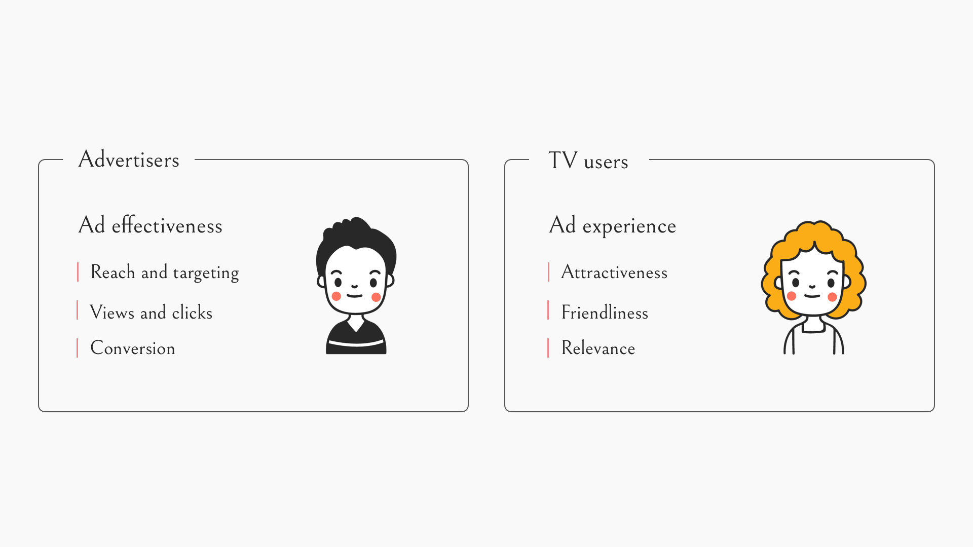
Samsung Ads serves two groups of people: advertisers and Samsung smart TV users. As a start of the design process, I worked
with marketers and UX researchers to learn the expectations of advertisers and user pain points in digital ads. We conducted extensive research
through user observation, interviews, and competitor analysis.
Advertisers care about the effectiveness of ads - the number of views and clicks which potentially lead to sales. When considering a business partnership with
an ad platform, they focus on reach and targeting, how likely an ad would be viewed, the size of the ad creative, etc. Beyond that,
post-click is another important factor in presenting further information and encouraging purchase.
On the other hand, ads are generally seen unfavorably by people. So, the design challenge was to create an ad experience that was
not merely acceptable but one that people would find useful and enjoy. To understand people's behavior and attitude, I conducted two types of research:
TV interaction analysis: analyzing TV usage data to understand how the traffic goes on TV.
Article/news review: understanding people’s thoughts regarding digital ads across competitor platforms and devices (web, mobile, OTT, etc.).
The main findings from my research were liberating and inspiring - people don’t hate every ad; they hate the obnoxious ads. For instance, people don’t like
pop-up ads because they interrupt what they are doing. People also feel irritated by ads that are not polished or look unprofessional. Ads are
acceptable if they are less disruptive to what people intend to do and relevant to their interest. Furthermore, people don’t mind ads that enable free movies.
Market Research and User Study
Ideation
A quick summary of the research findings:
Advertisers want people to see and click on their ads. They care about targeting effectiveness, ad exposure, creative size, etc.
People don’t mind ads if the ads are not disruptive, polished, and relevant to them.
Therefore, my design is to create an ad experience that is:
Appealing: visually attractive that people will pay attention to the promoted content.
Effective: easy to use, and encouraging to get clicks that take people to purchases.
Contextual: immersive and relevant to the intent that people come to the screen for.
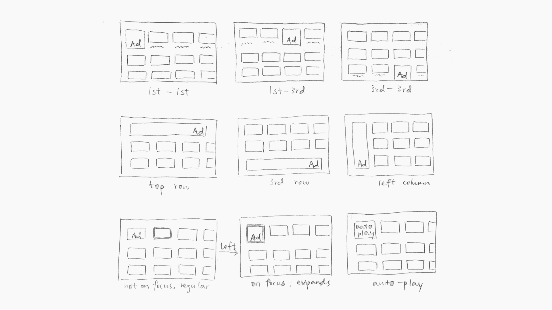
To amplify ad exposure, I started with identifying the most visited screens on TV. And then, I created many variations of ad placement designs in the high traffic screens across TV model year from 2015 to 2021. The design explored possibilities in the following ways:
Layout: horizontal on the top, vertical on the side, blend in the middle.
Size: small and conservative, big and aggressive, expandable on hover.
Format: autoplay video ad, gif animation ad, static banner ad.
Information: with or without prices, airing dates, call-to-action (CTA) buttons, etc.
Category: ads of TV shows and movies, automobiles, consumer packaged goods, etc.
Regarding creative quality control, the operations team has been following the rules that were created by the marketing team. And the engineering team developed a set of
algorithms that learned people's watching taste which could be applied to improve targeting.
Paper Sketches
Sample Wireframes and Mockups
Cross-functional review
To narrow down design options, I built animated presentation slides and interactive prototypes to review the design with the team, and collected feedback from product managers,
engineers, marketers and sales (who have direct contact with the advertisers). Through the discussion, we developed a better understanding of our goals and formed
a clearer product direction.For example, the autoplay video ad is one of the top choices for a few reasons: it catches people’s eyes (marketing); it is
easier to implement than gif (engineering); it is more scalable given the inconsistency of Samsung smart TV operating systems (product).
User testing
The purpose of advertising is to deliver the product message to the right people. When people find the ad is helpful, they tend to show greater
interest in learning more information or buying the product. Therefore, the user testing was to validate if the ad was noticeable and encourage people to take action.
To find out the most effective design, I worked with UX researchers and conducted two types of study:
Online survey: to learn people’s sentiment; quantitative and quicker.
In lab usability testing: to verify interaction and visual design; qualitative and deeper.
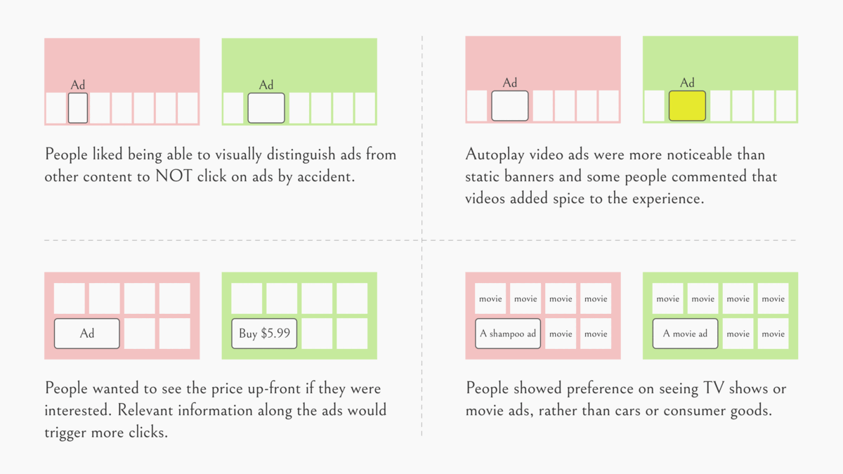
Main findings:
People liked being able to visually distinguish ads from other content to NOT click on ads by accident.
Autoplay video ads were more noticeable than static banners and some people commented that videos added spice to the experience.
People wanted to see the price up-front if they were interested. Relevant information along the ads would trigger more clicks.
People showed preference on seeing TV shows or movie ads, rather than cars or consumer goods.
User Testing Results
Based on the findings, in the next iteration, I focused on the designs that created visual difference between ads and other content in
the TV UI and added information about the ads that would help people with their decision-making. Beyond that, the ads team prioritized
autoplay video ads as the top format and focused on TV shows and movies as the main category.
Throughout the process, I intentionally drove the conversation and direction to align with the design vision which was to create appealing,
effective and contextual advertising experiences.
Launched Product
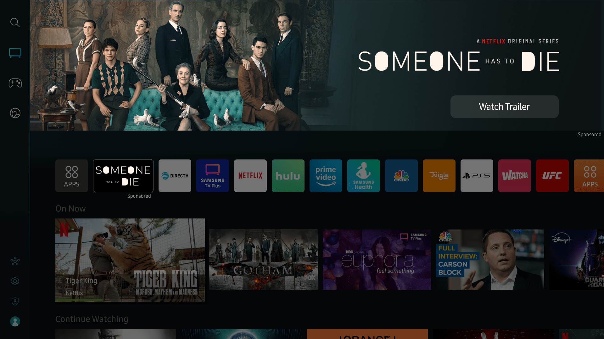
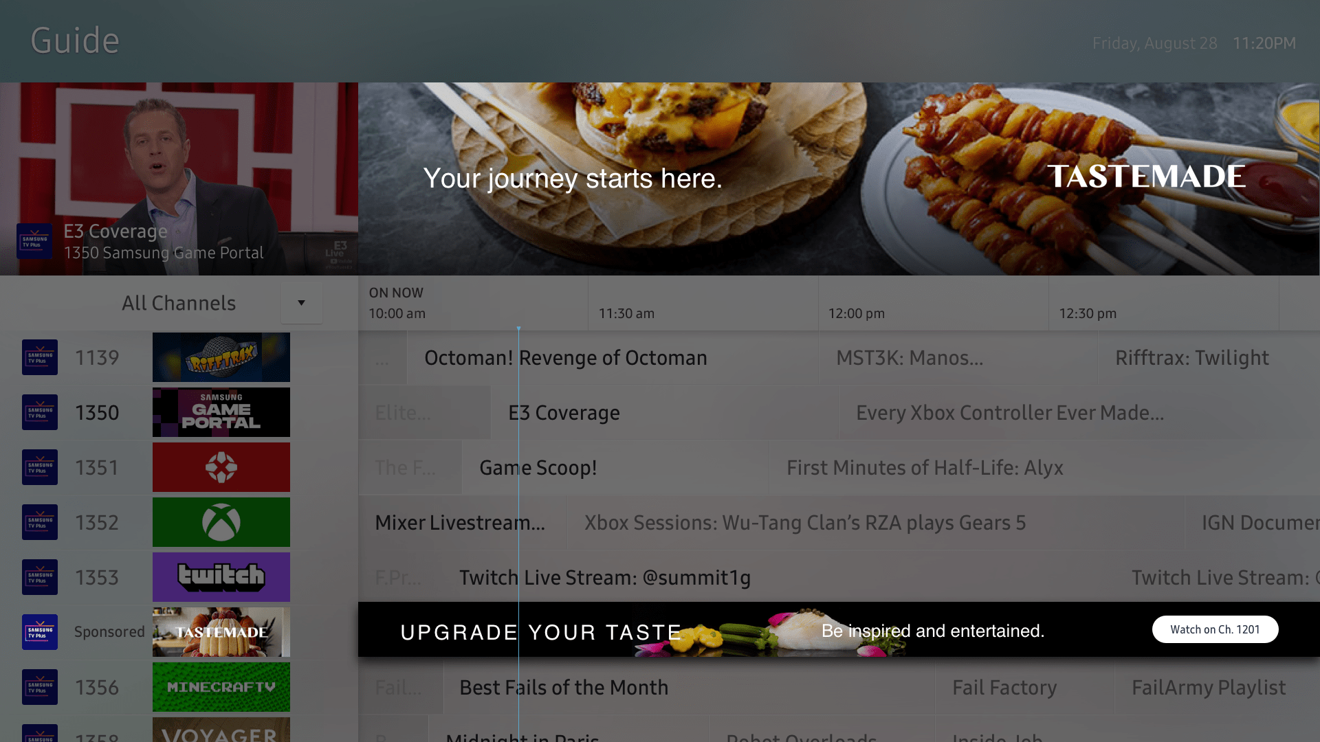
Video Ad in Universal Guide on TV 2020-2021
Masthead Ad in home screen on TV 2022
Ad in EPG on TV 2018-2019
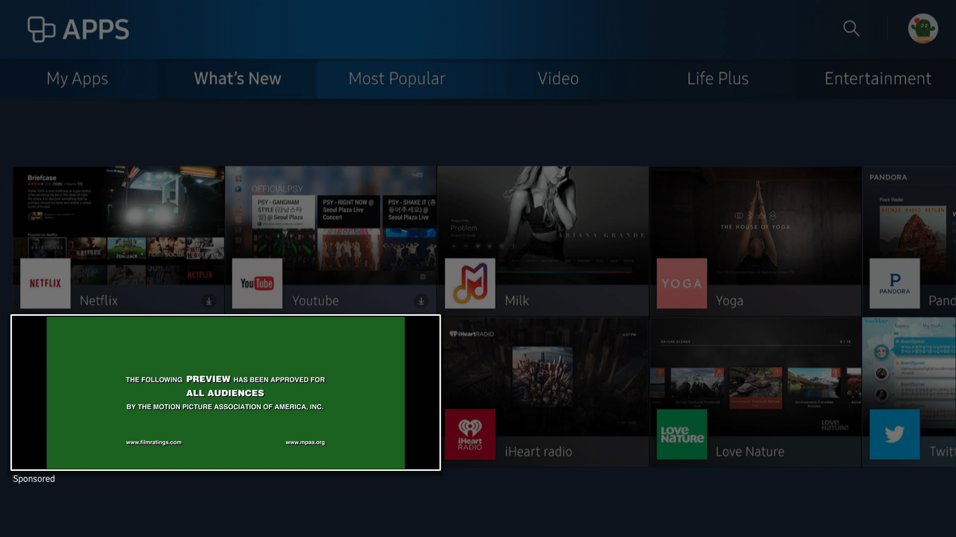
Video Ad in App Store on TV 2017-2019
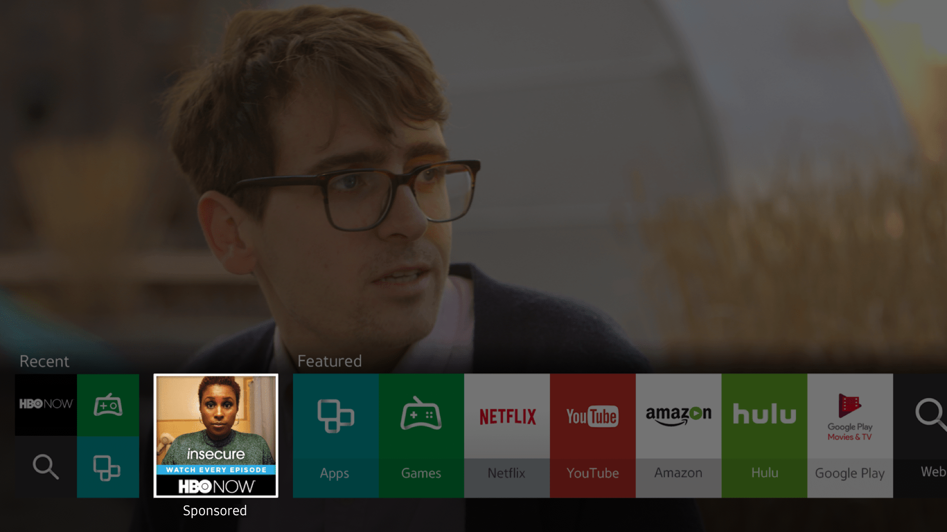
Video Ad in Apps Panel on TV 2016
Ad in home screen on TV 2015
The Impact
Business Success - Win Advertisers
Since new ad placements launched, Samsung Ads has been getting media attention and loved by advertisers. A redesign of one of the ad placements
drove the number of views to increase by 33%. Our revenue has been doubling every year since 2016.Last year, program tune-in was improved, as the viewership of a summer premiere episode on a top broadcast network
more than doubled (200%+lift). Also, we facilitated 10 times greater views at a subscription video streaming app through Samsung Ads
native and cross-device experiences.
UX Success - Win Users
The advertising industry has complicated rules and regulations. Designing an ad platform is even more
complicated for seeking the balance between user experience and business goals. As a designer of an ad
platform, I always believe that UX and advertising should not and do not have to be enemies. My design is
driven by the philosophy that good design is good business which leads the design to be
native, non-intrusive, and even pleasant. Good ads can be useful and enjoyable to the users
while bringing more profits to the advertisers.
As a reflection of this design philosophy, in a quick poll that people were asked about their opinion on ad experience on Samsung smart TV, most people answered "like" and "neutral".
Design Culture Evangelism
Since design has historically been equated with aesthetics and craft, designers have been celebrated as
artists. It is a common situation that designers are experiencing misunderstanding of design from
people across functions at work. As a designer, I have been spending more time explaining what design is
than actually doing it.
Instead of adding cosmetic layers, design is a crucial cognitive ability to solve people’s problems given
the knowledge of human conditions and human needs. In the real world of business, design should be driving
product innovation instead of being subsidiary and driven by technology or business. Design should not be an extra;
it needs to be a core competence.
I evangelize design thinking and establish the design process in three ways: I promote the vision of design in day-to-day
work; I give design talks to team members as well as key stakeholders; and I invite people to be participants of my user research
and usability testing. Since I joined the team, noticeable changes have happened as collaboration flow and product
development process have been reshaped with design thinking incorporated. People have started to think of design differently.
There is no longer any real distinction between business strategy and the design of the user experience. Although
changing workflow and changing people's minds is tough, I believe it is worth making the effort to release the power
of design and make a meaningful impact.